
Maessen Klusjes & Herstellingen
A roofing and repairs site designed for the phone in a homeowner's hand.
A local trade site built around clarity: plain language, visible work and a direct route to a quote.
- Year
- 2026
- Role
- UX/UI Design · Web Design · Responsive Design
- Type
- Self-initiated concept
- Sector
- Local business · Roofing and repairs
- Region
- Kapellen · Antwerp
A concept site for a roofing and repairs business serving Kapellen and the Antwerp region.
The design answers three questions fast: what they do, where they work and how to reach them.
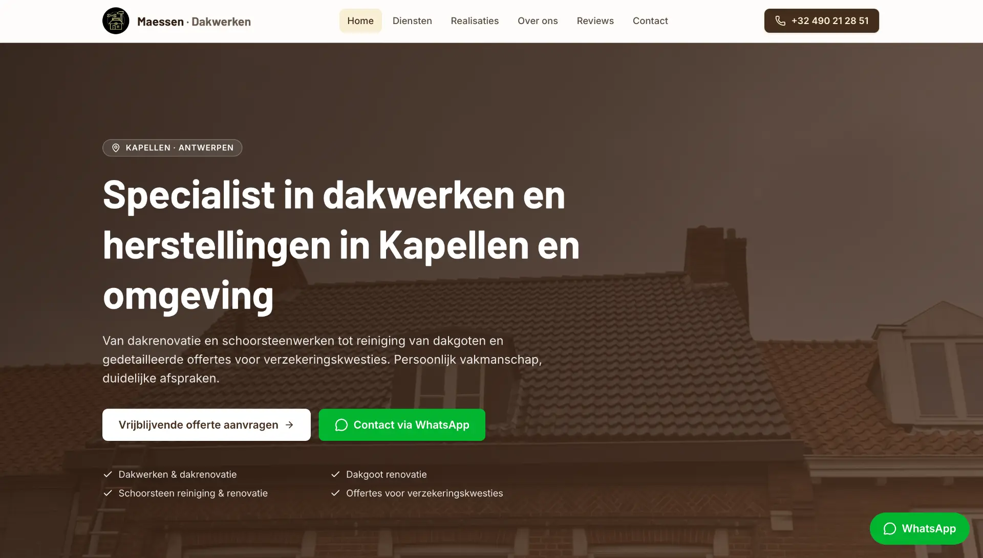
A trade site that answers before it sells.
The opening immediately states the service, region and two contact routes — built for an urgent, mostly mobile visitor.
Warm neutrals, one dark ground, generous type.
Warm neutrals, a dark ground and generous type create a practical, approachable visual system.
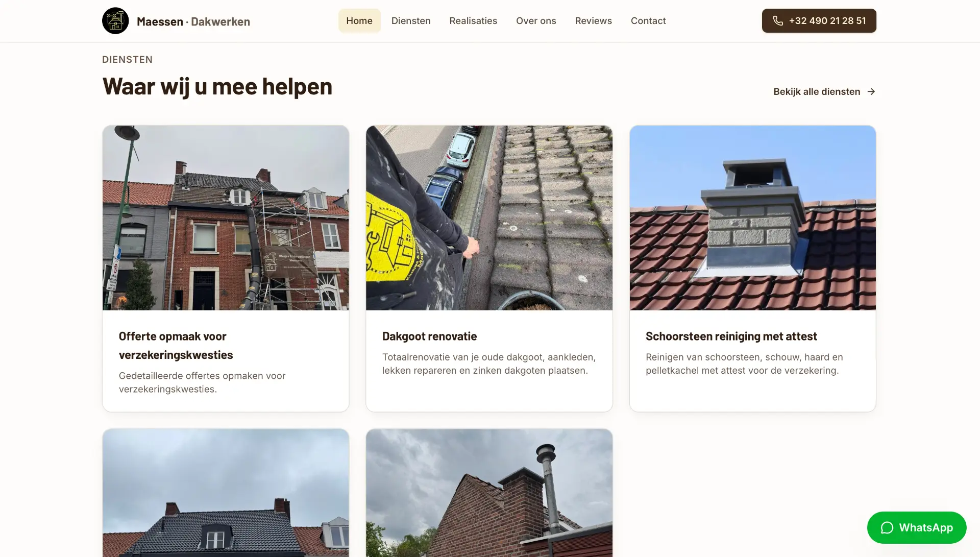
Named work, not categories.
Services are described in the language customers actually use, with photography showing the work behind them.
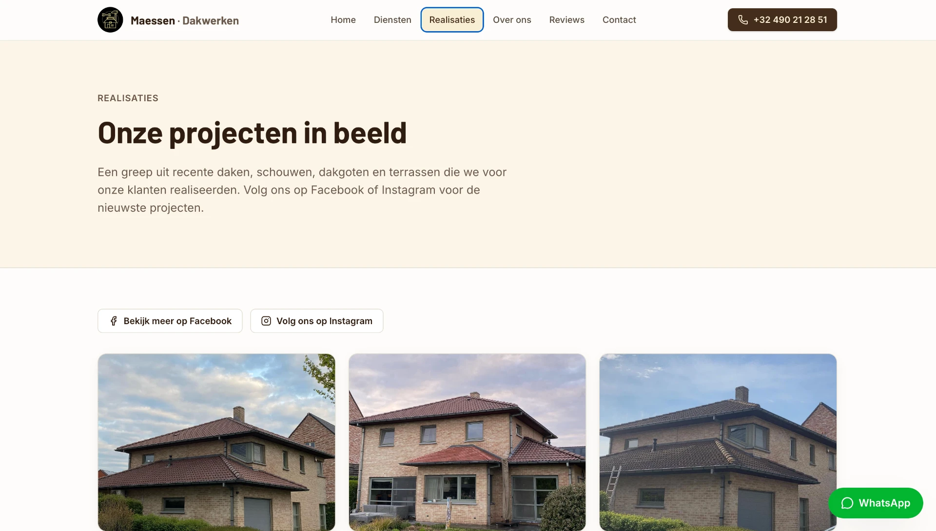
Proof placed where doubt appears.
Reviews, values and completed work provide proof exactly where a homeowner needs reassurance.
One route, repeated without noise.
One primary action — request a quote — with phone, messaging and email always within reach.
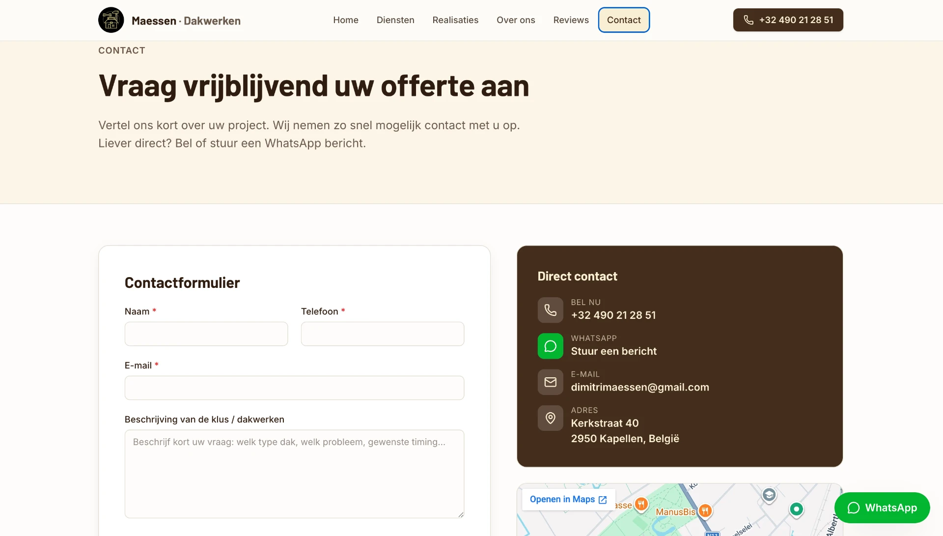
The work shown as it is.
Recent projects are presented as a straightforward record, without exaggerated claims or staged before-and-after theatre.
Designed on the phone first.
Single-column layouts, generous tap targets and thumb-friendly contact keep the experience practical on mobile.
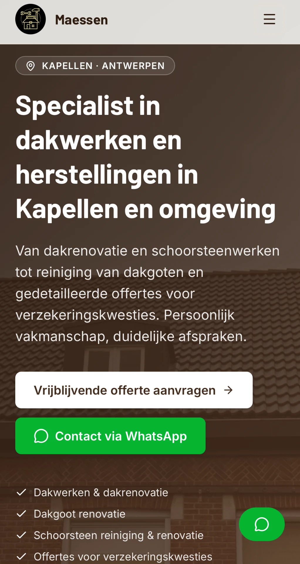
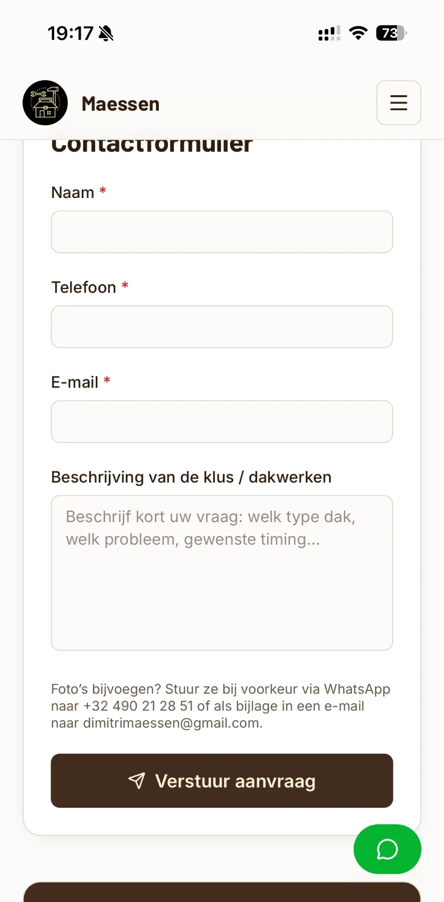
Local, legible, and easy to trust.
The result introduces the business, shows its work, states its terms and gets out of the way.
Craft communicated through clarity.
A local trade earns work by being findable, legible and easy to contact. The design does nothing more ambitious than that, and nothing less.
- UX/UI Design
- Web Design
- Responsive Design
- Content Structure
- Local Business Positioning
- Studio
- i6 Concepts
- Scope
- UX/UI Design · Web Design · Responsive Design
- Documented
- 2026 · Self-initiated