
Preloved Fashion Platform
A better digital experience for buying and selling preloved fashion.
An editorial fashion platform combining buying guides, styling inspiration and selling advice.
- Year
- 2026
- Role
- Brand Direction · UX/UI · Web Design · Content Strategy
- Type
- Self-initiated concept
- Focus
- Editorial · E-commerce · Responsive Design
A platform for buyers and sellers in Belgium and the Netherlands, bringing guides, styling and selling advice into one editorial experience.
A self-initiated study spanning brand direction, UX/UI, web design and content strategy.
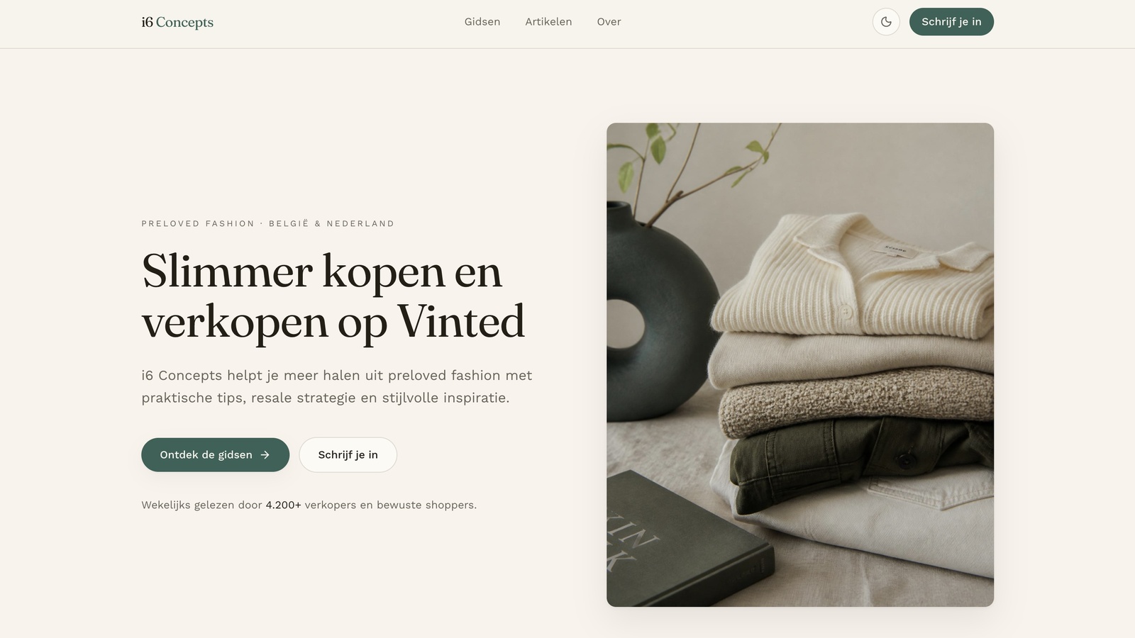
A marketplace is not an experience.
Preloved has scale, but little guidance. This concept turns the transaction into an editorial experience that helps people buy, sell and style with more confidence.
Premium, but never precious.
Typography and space do the work. A clear type hierarchy and generous whitespace create a premium feel without becoming cold.
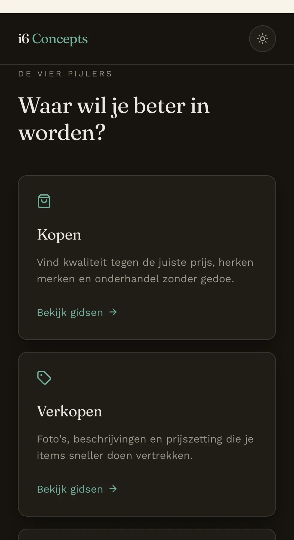
Four pillars, one clear map.
Everything belongs to Buying, Selling, Styling or Growth. The structure stays shallow and easy to navigate.
- Buying
- Guides that make a second-hand purchase feel considered: sizing, condition, materials and what to check before it ships.
- Selling
- Practical advice for sellers — photography, descriptions, pricing and the rhythm of keeping a wardrobe moving.
- Styling
- Editorial inspiration: how preloved pieces are combined, so the platform reads as a fashion title rather than a listing grid.
- Growth
- For those who treat selling seriously — building a recognisable profile, a consistent voice and a repeatable routine.
Room to read, room to browse.
Wide layouts, generous reading space and curated indexes make browsing feel editorial rather than endless.
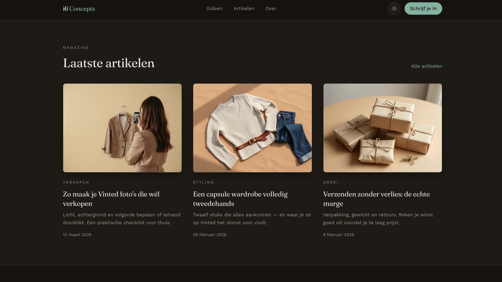
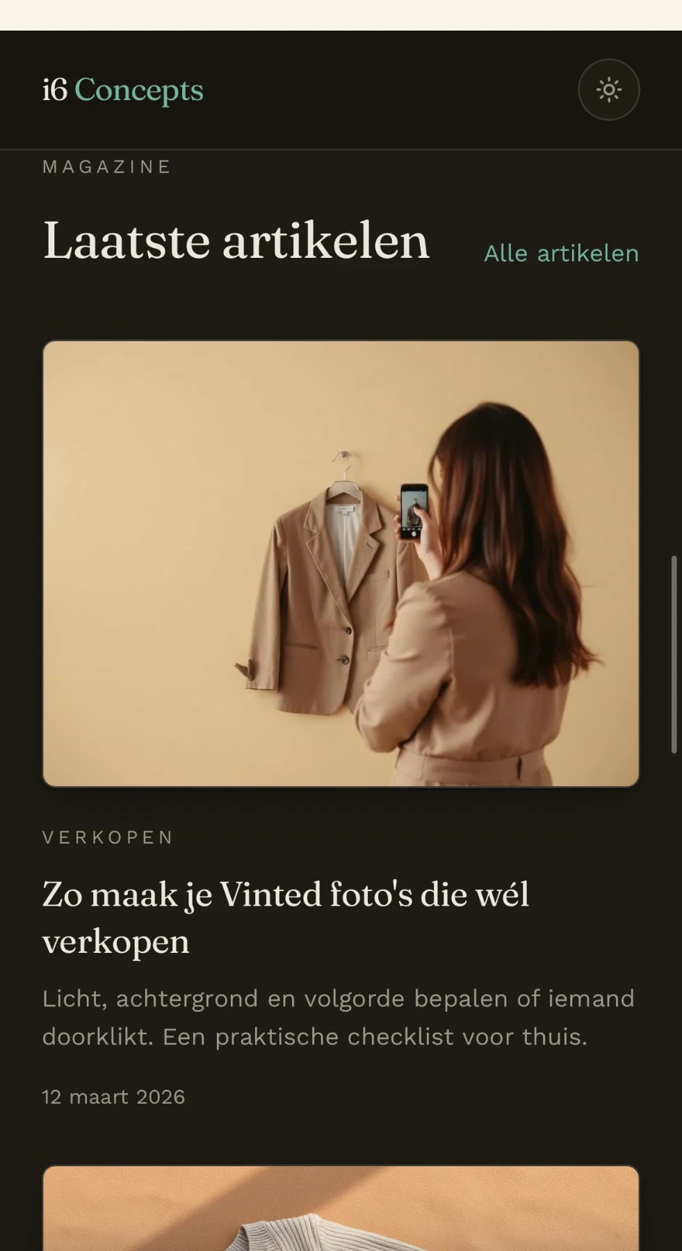
Guides, styling features and selling advice on one grid
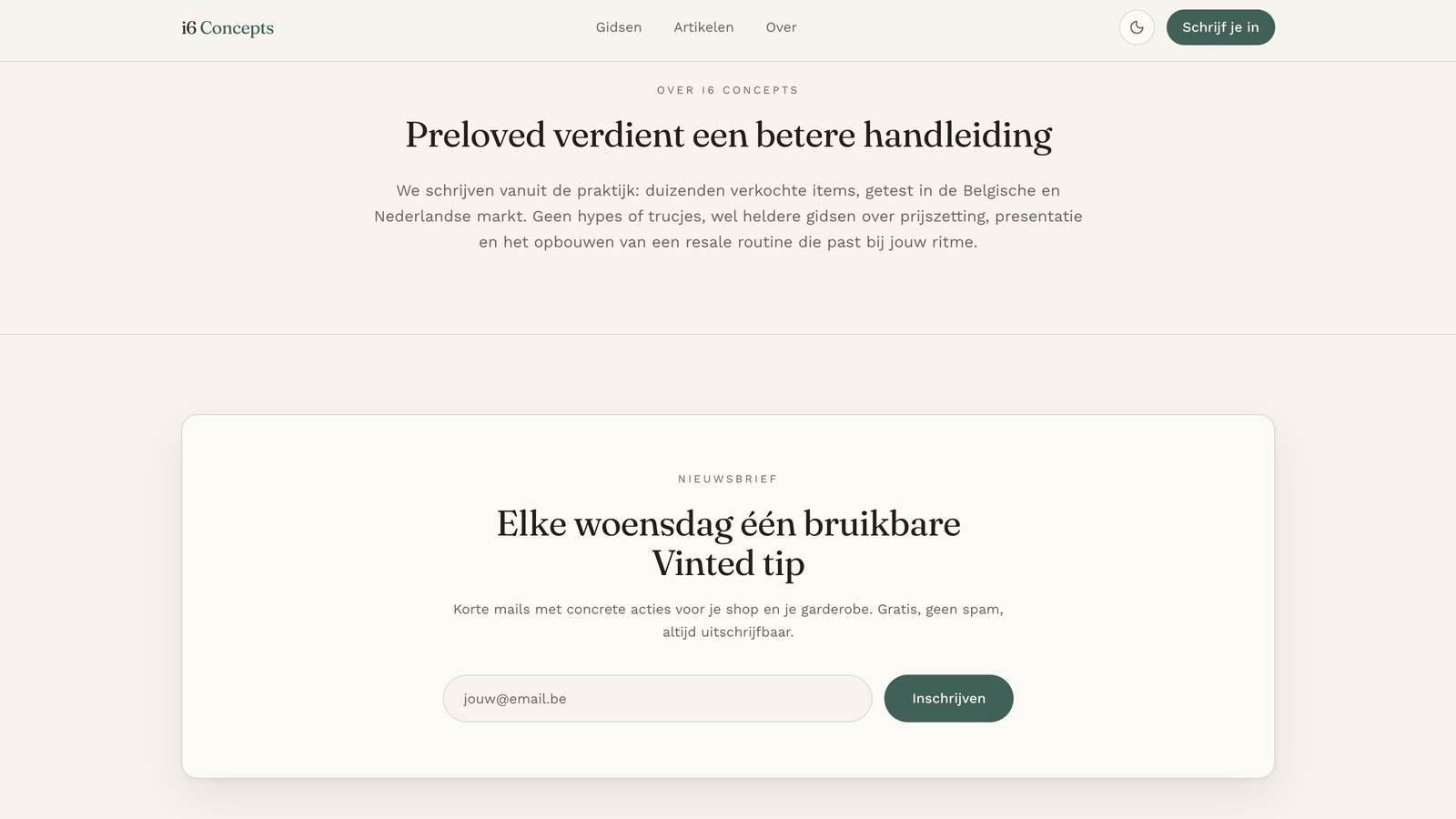
Utility written like a magazine.
Guides follow a consistent editorial structure: what to do, what to avoid and what to remember.
Discovery that leads somewhere.
Commercial touchpoints appear where intent already exists. Conversion becomes the natural next step, not an interruption.
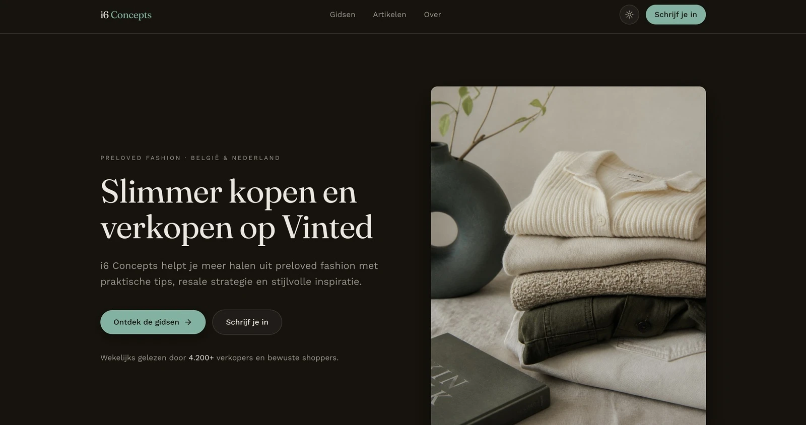
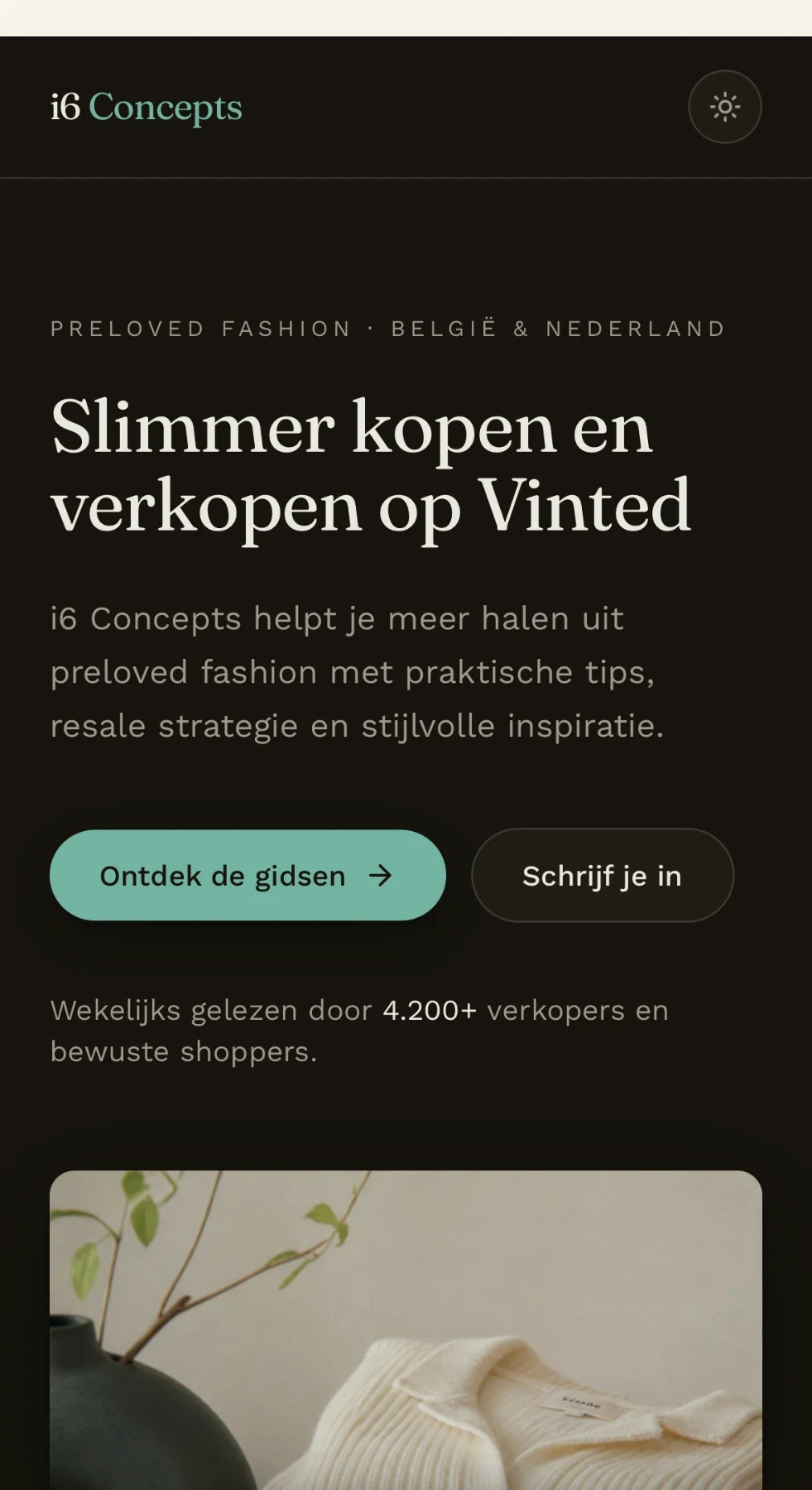
The same system, a different light.
Dark mode changes the atmosphere, not the system. The same grid, type and spacing carry through.
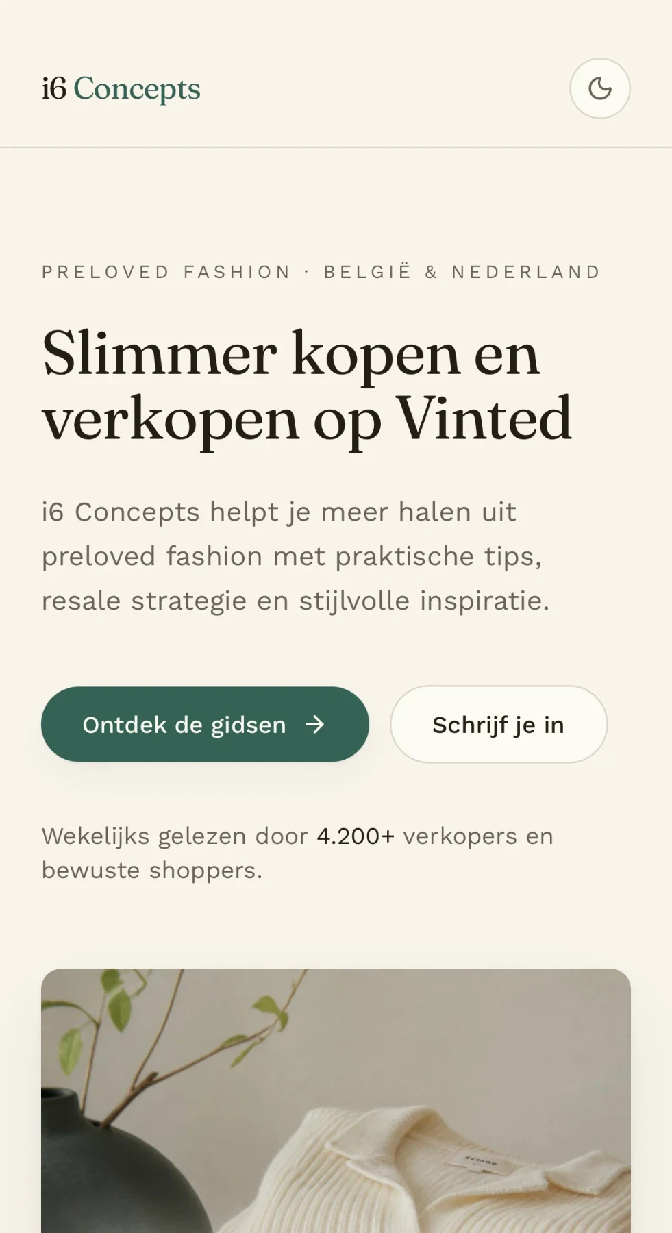
Designed for the phone first.
Single-column reading, taller imagery and thumb-friendly actions make the mobile experience feel designed rather than reduced.
Dark mode: same system, retuned contrast
Responsive Experience
Designed as a responsive system from the start, with the same editorial hierarchy translated into a focused mobile experience.
One publication, two audiences.
A responsive editorial-commerce concept that combines preloved fashion, practical education and content-led discovery into one cohesive digital experience.
- Studio
- i6 Concepts
- Scope
- Brand Direction · UX/UI · Web Design · Content Strategy
- Documented
- 2026 · Self-initiated